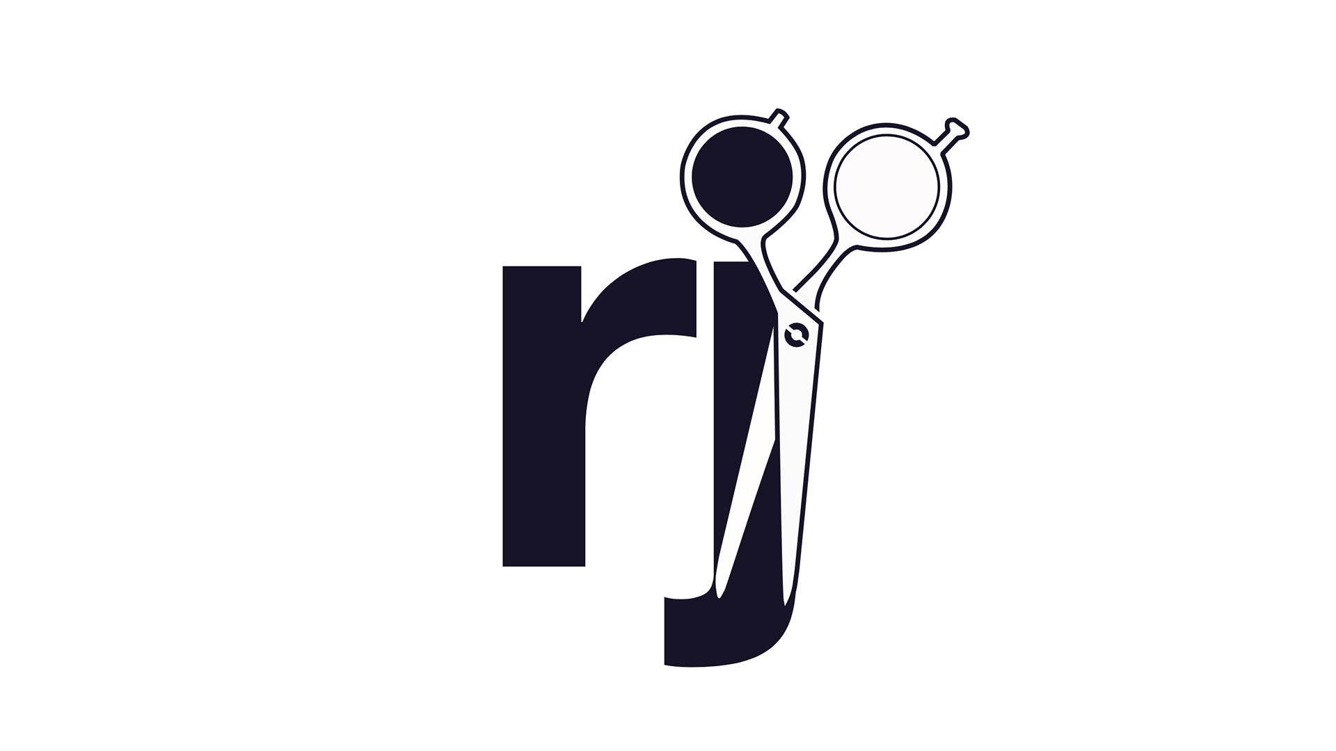
With their logo, I found it interesting how the lowercase "J" played well to the shape of a scissor. So I incorporated a pair with the "RJ" as their final mark manipulating the logo on adobe illustrator.
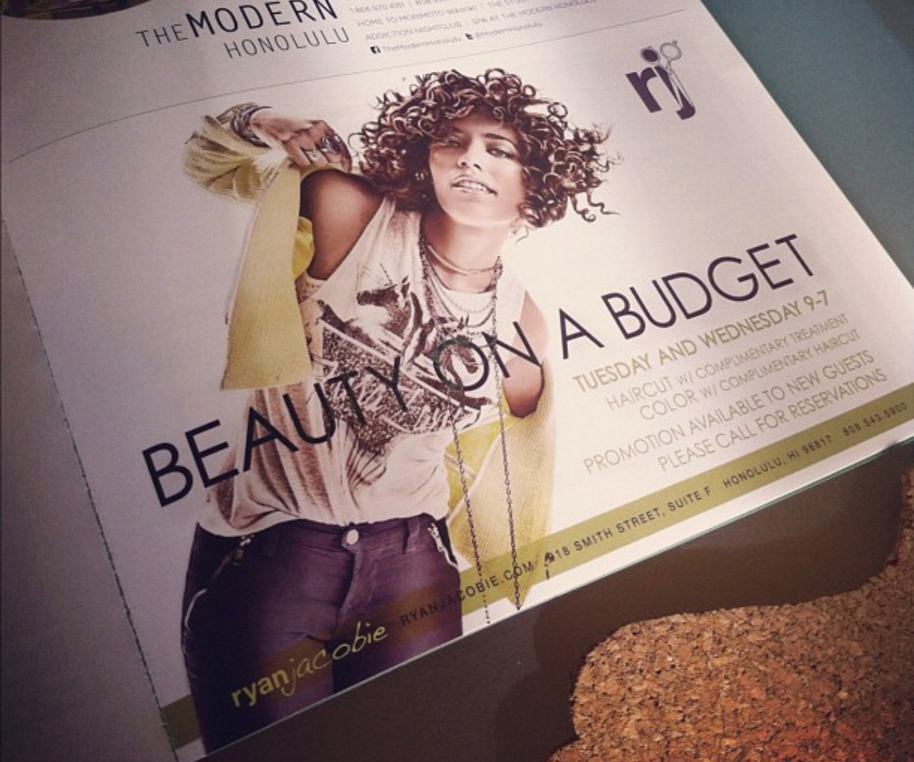
This advertorial was featured in flux magazine and I used the pop color of the model's jacket to make the typography stand out. for this ad I also angled the photo in adobe photoshop to give a dynamic layout and placed the logo at the top right corner.