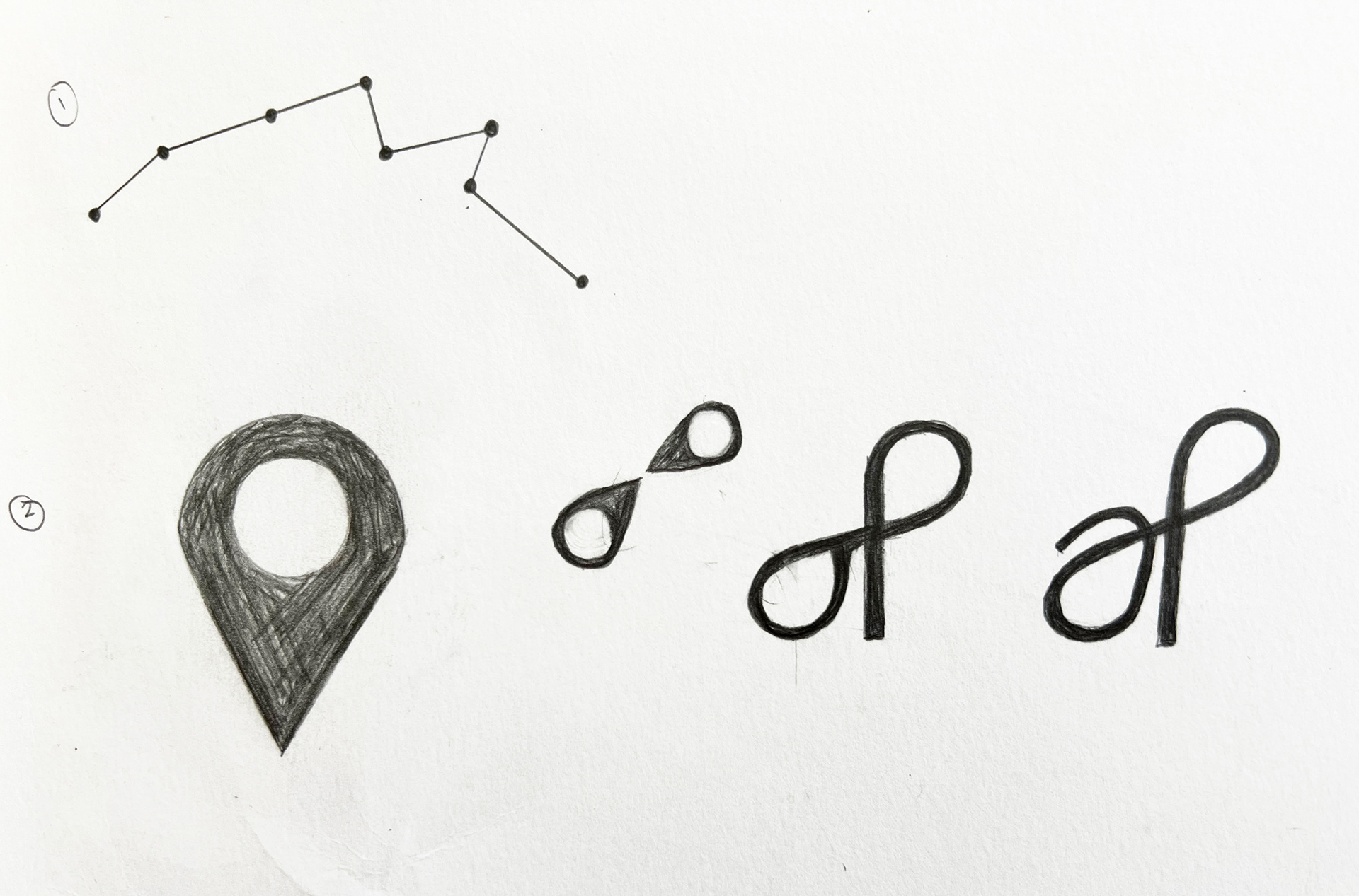
I kept with the geometric feel for their logo and played with the idea of connecting lines, something that would be easily scalable when printed.
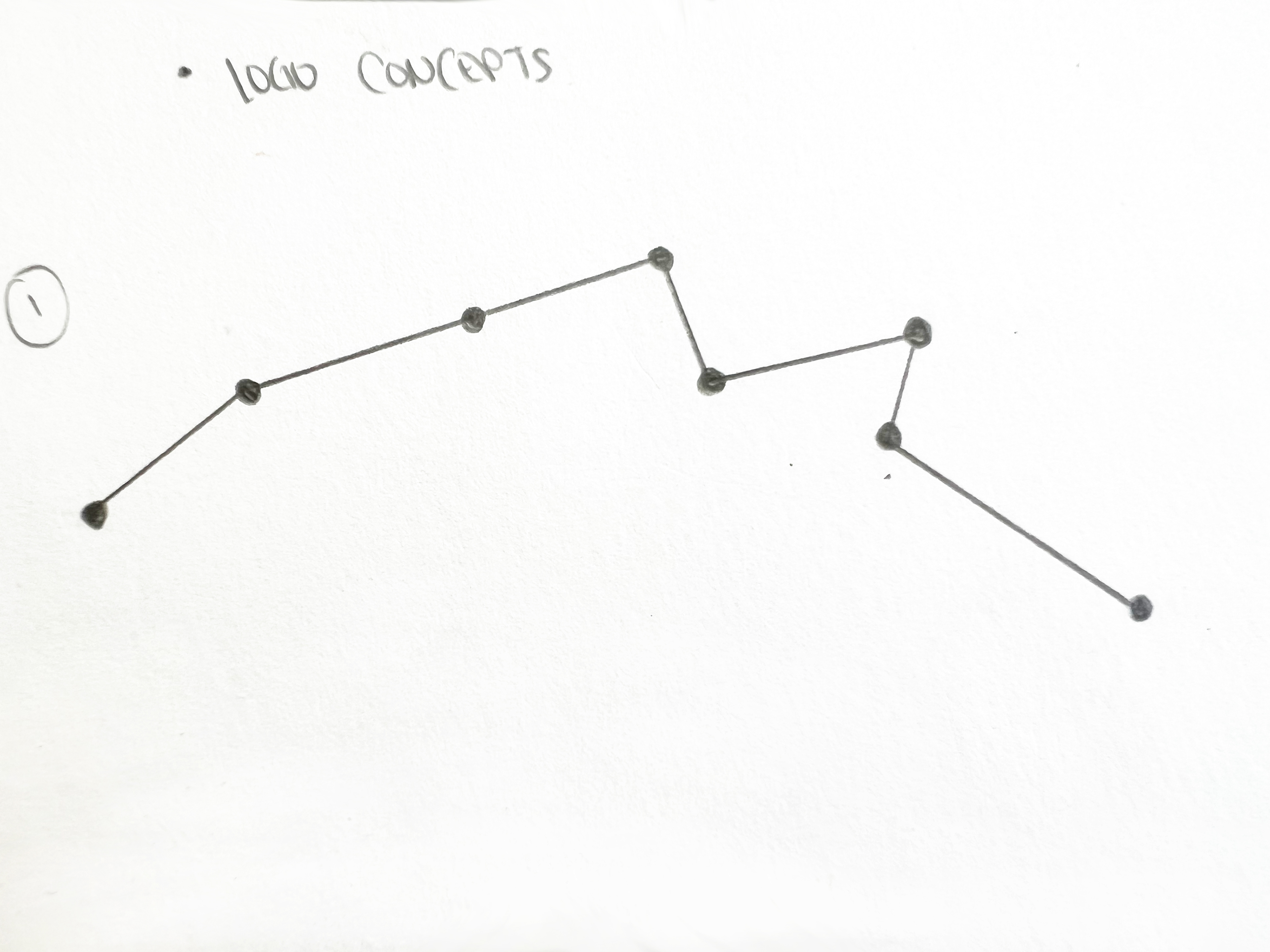
I found a digital map of the Hawaiian islands to pinpoint where the major cities were. each dot indicated the city of the eight islands and they were connected to form the final logo. I love the simplicity of the overall result. the mark was easily scalable for stickers and banners for their community events.
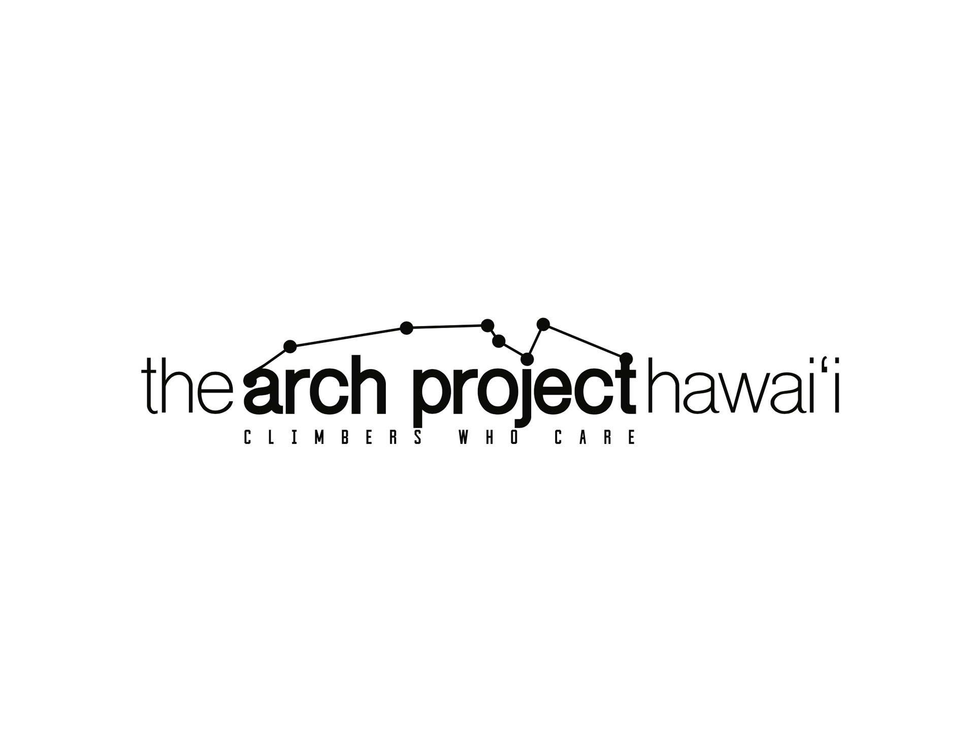
this was the final result paired with type and their slogan: climbers who care.
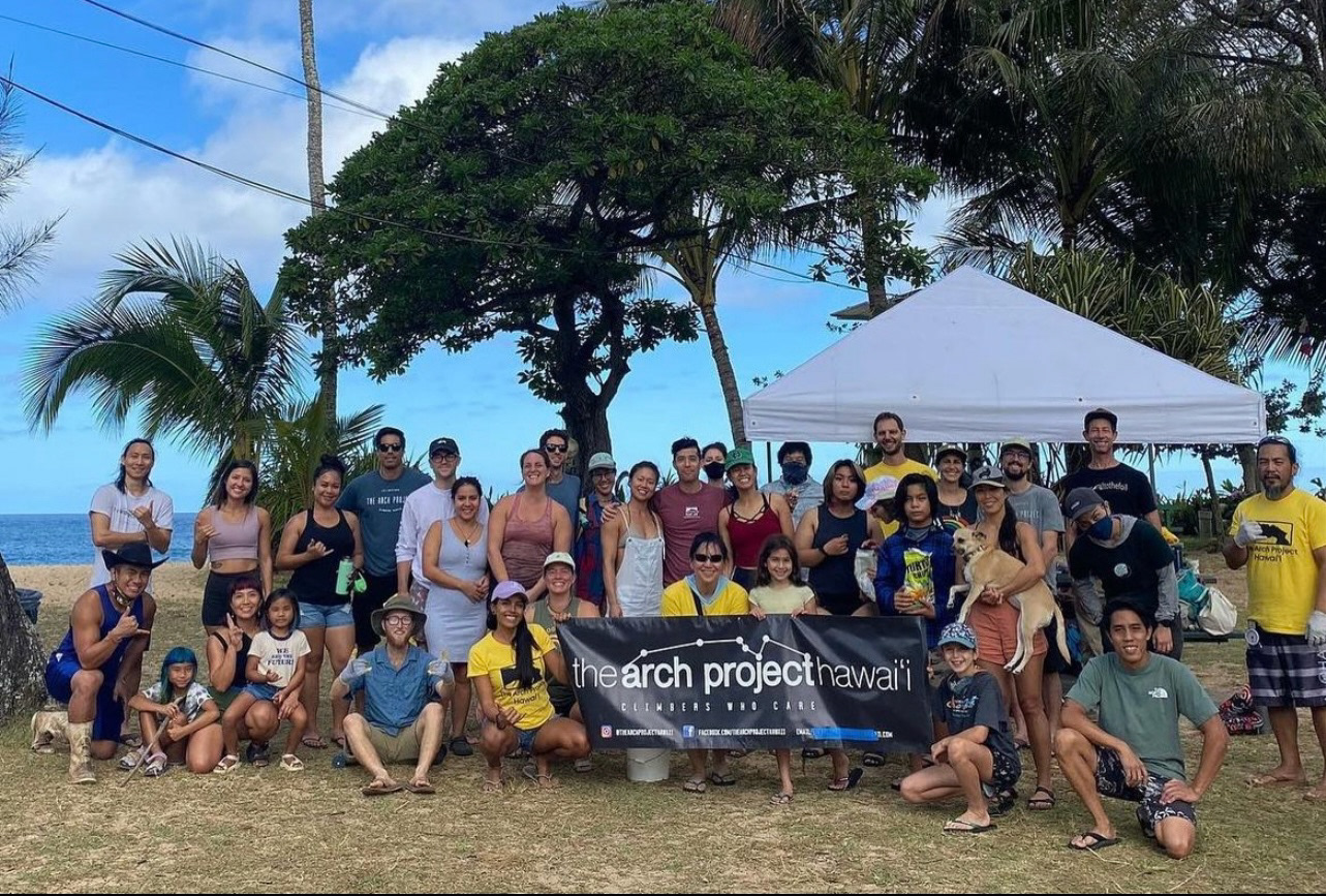
for each beach clean up, The arch project hawaii would have a banner out as a meeting point early in the morning. their waimea bay beach clean ups were done every summer or as needed.
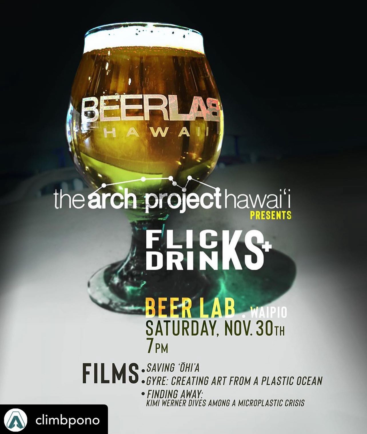
This design was done for the social media blasts when The arch project collaborated with a neighboring business, beer Lab hawaii, for movie nights events.

The Arch Project would also have gear swap events to help the community upcyle their gently used belongings. I designed this for their social media blasts and for posters around the gym.