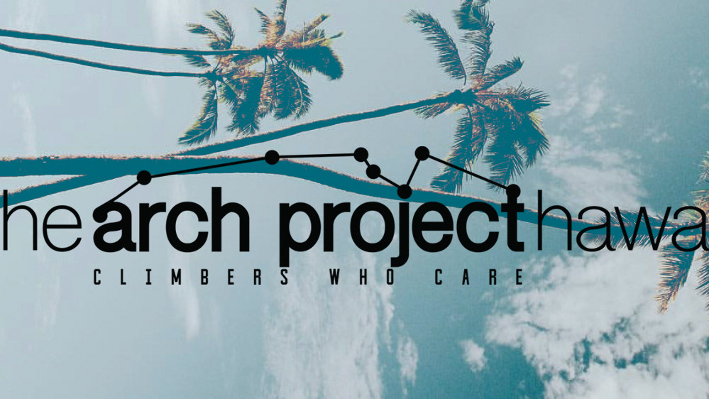
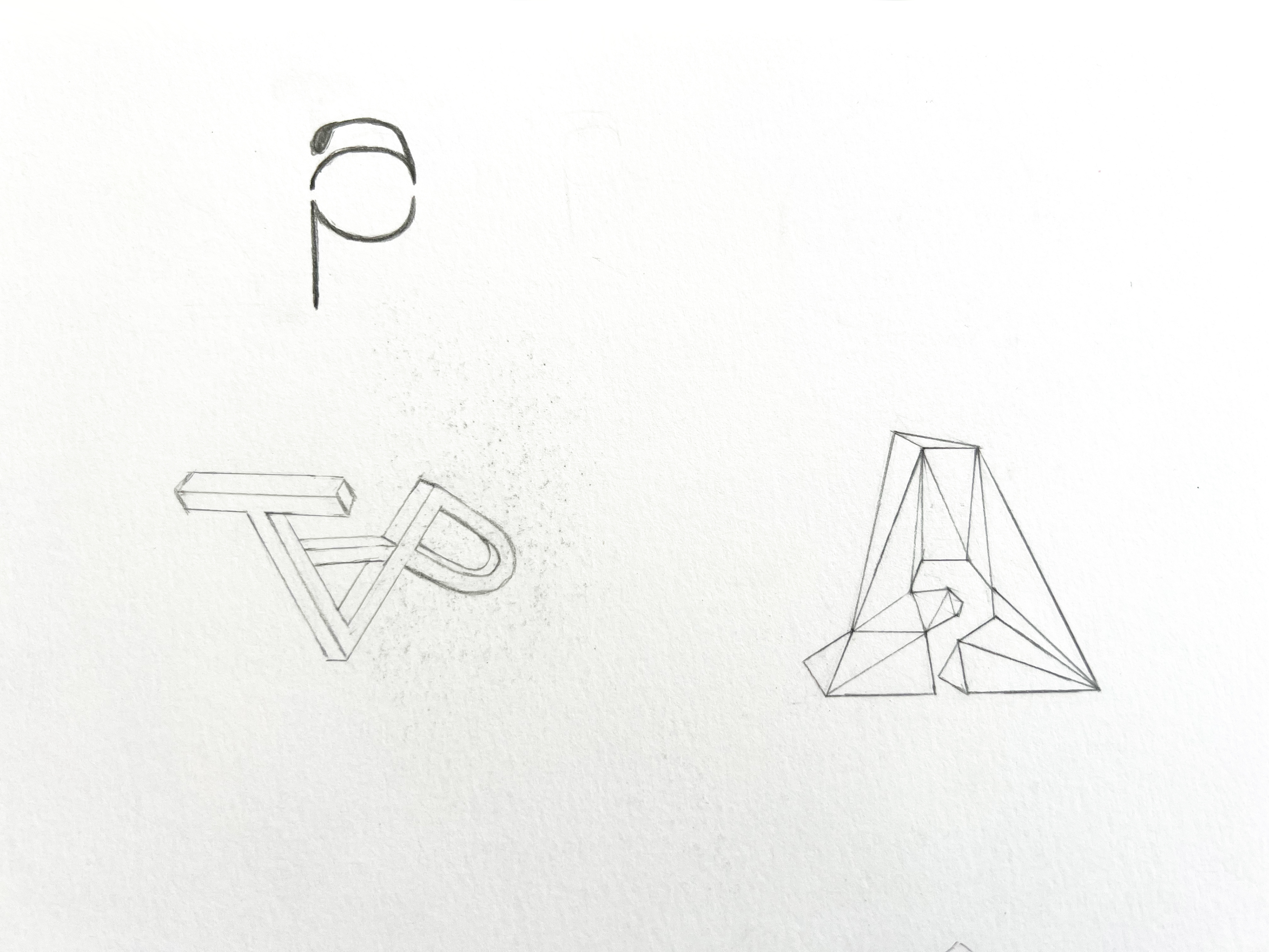
For The Arch Project Climbing center's logo, I decided to go in a geometric direction mimicking the look of their climbing walls.
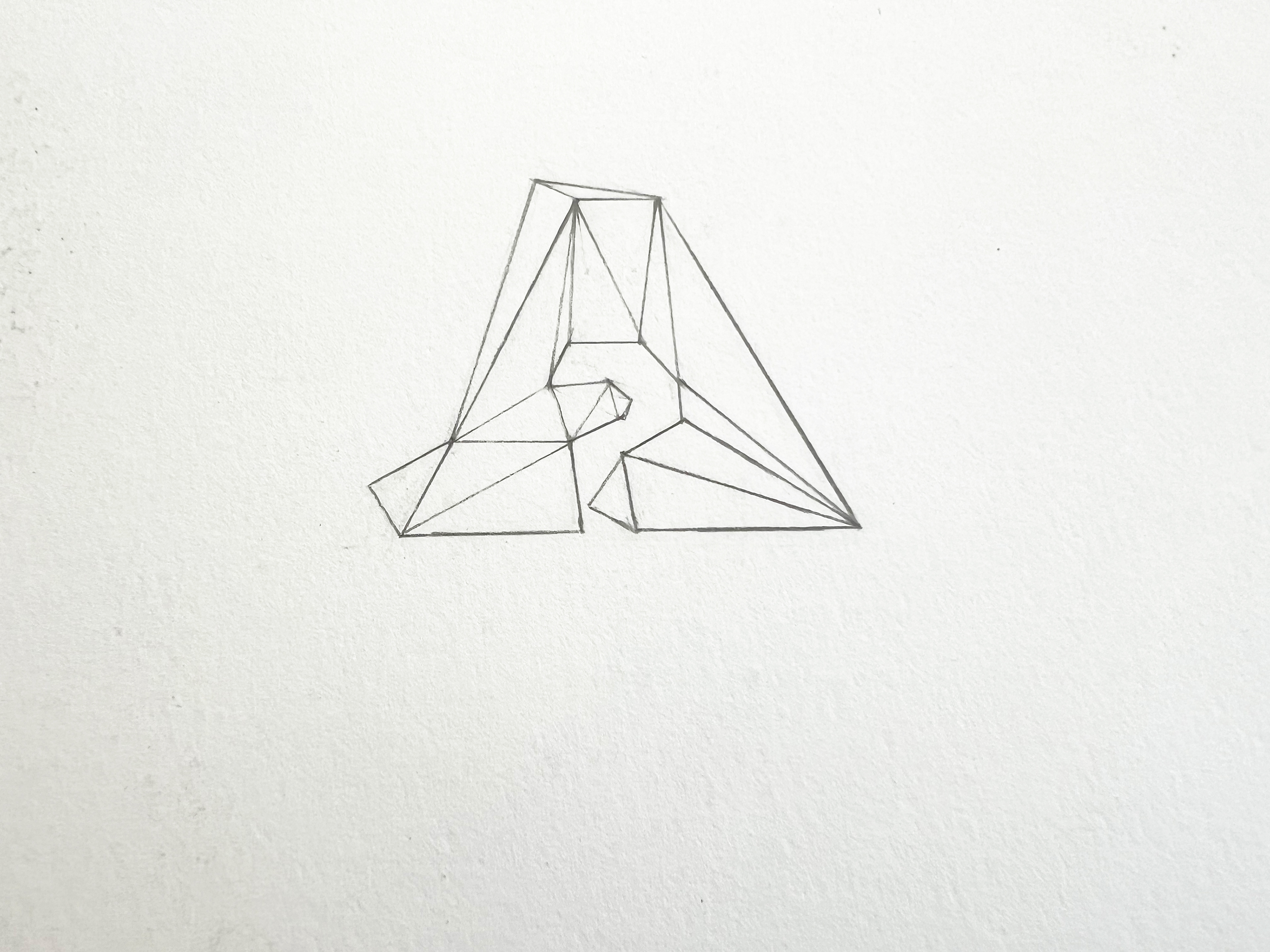
I thought I was interesting playing with the positive / negative space of a logo. From this draft, decided to start playing with the idea of an encased arrow.
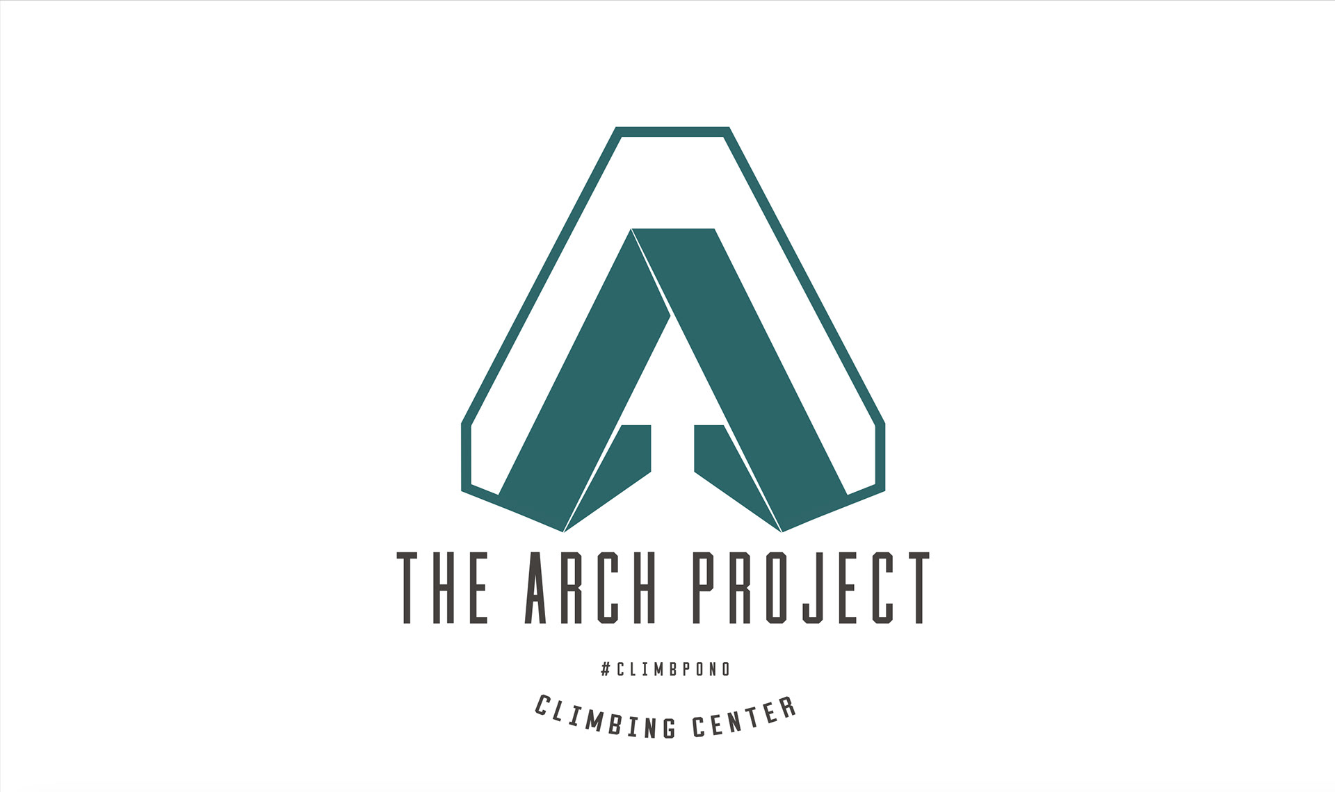
the arch project climbing center's final logo featured an arrow facing up with an outline. My client wanted modern typography So I chose a san-serif typeface and played with kerning on adobe illustrator.
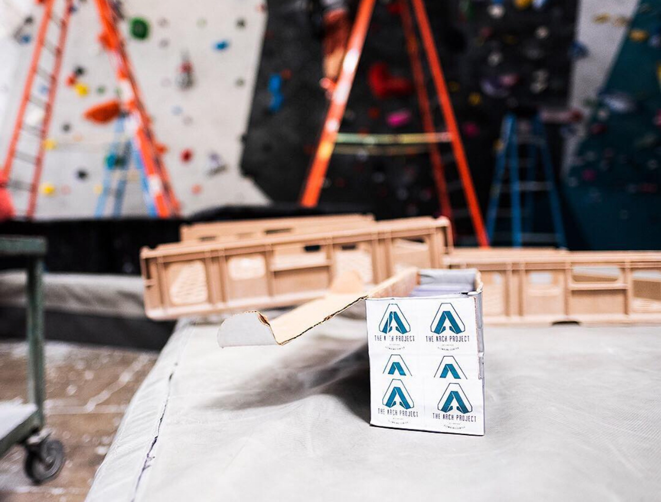
This is how their logo looked printed as their placards for route setting.
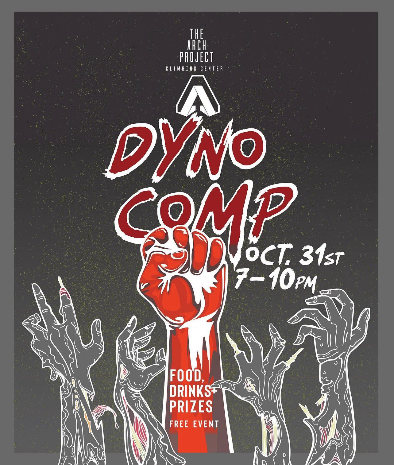
I played with the zombie idea on adobe photoshop for their halloween competition and incorporated their logo tweaking screen overlays. I then used this image as their social media blasts.
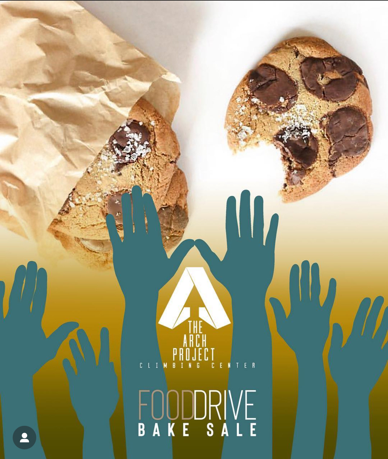
TAPCC focused on food drives during the fall season so I focused on images to get climbers carb ready for the bake sale event.

I incorporated images of their youth group for their gym's first kid's competition. with overlay screens I manipulated this image on photoshop to reach the final look.
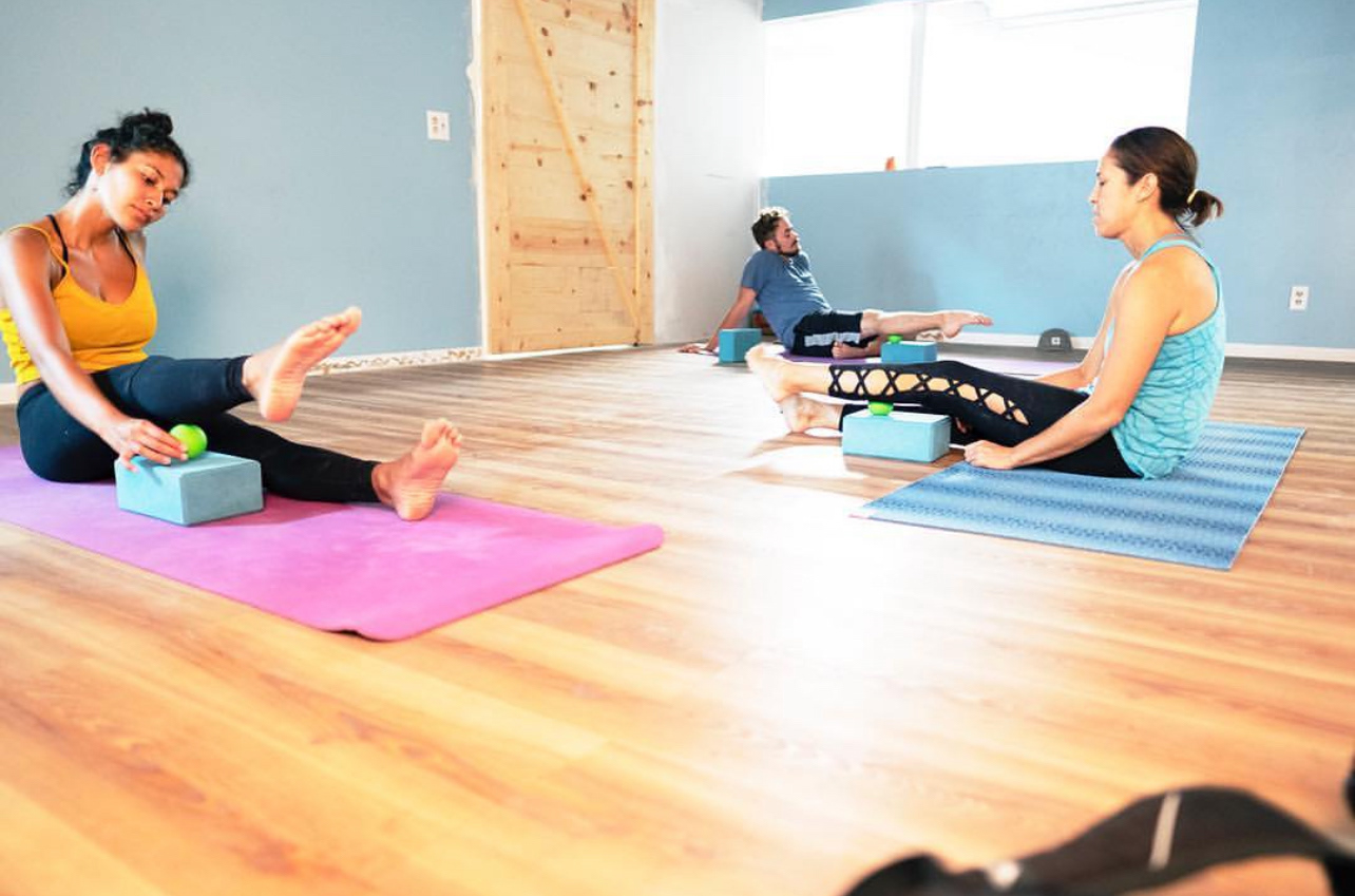
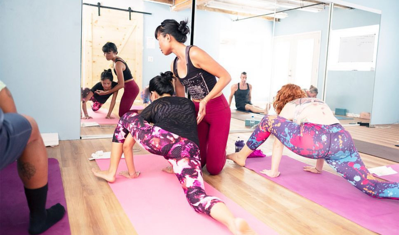
throughout their website I incorporated photos that I took of their clinics, like this recovery class.